User Interface
Clarity and Conciseness in User Interface Design

I created a post earlier in the semester that discussed what elements contribute towards “good” software; one of these elements is elegant design, which is lacking in software that is “clunky” as well as bothersome to navigate and use.
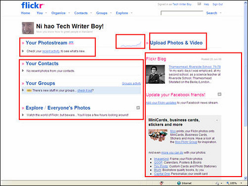
A component of design that is more specific and can be more easily analyzed is the user interface, which combines aesthetics with usability. I anticipate that creating a (somewhat) functional but polished user interface will be a challenge for project teams in general, so I located an article that describes what comprises a “successful” user interface.
The article’s author highlights clarity as “the most important element of user interface design” because it must simultaneously communicate meaning and function to users. Conciseness is the next most important element; it demands that designers be careful when adding explanations or definitions to their applications to avoid clutter and confusion. Professor Hohne called for a hybrid of clarity at conciseness while reviewing our prototype during a meeting on Tuesday: “I want to see green, yellow, and red status bars, not a whole lot of extra information.” With this remark, it became clear to me that a successful user interface may actually draw on the same principles as a successful status report document.
Having read through the linked article and this post, what steps should you take to keep your prototype’s user interface clear and concise? Will the responsibility of ensuring clarity and conciseness be left to one person on your design team, or to the entire team? Lastly, how might your approach differ if you had to produce a more complex application?

