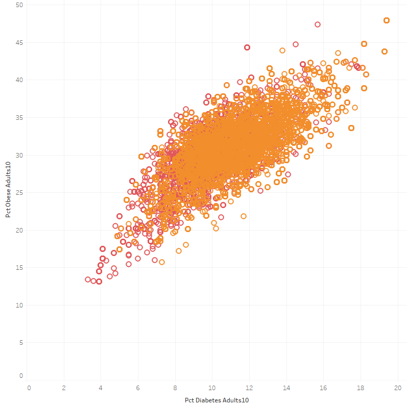
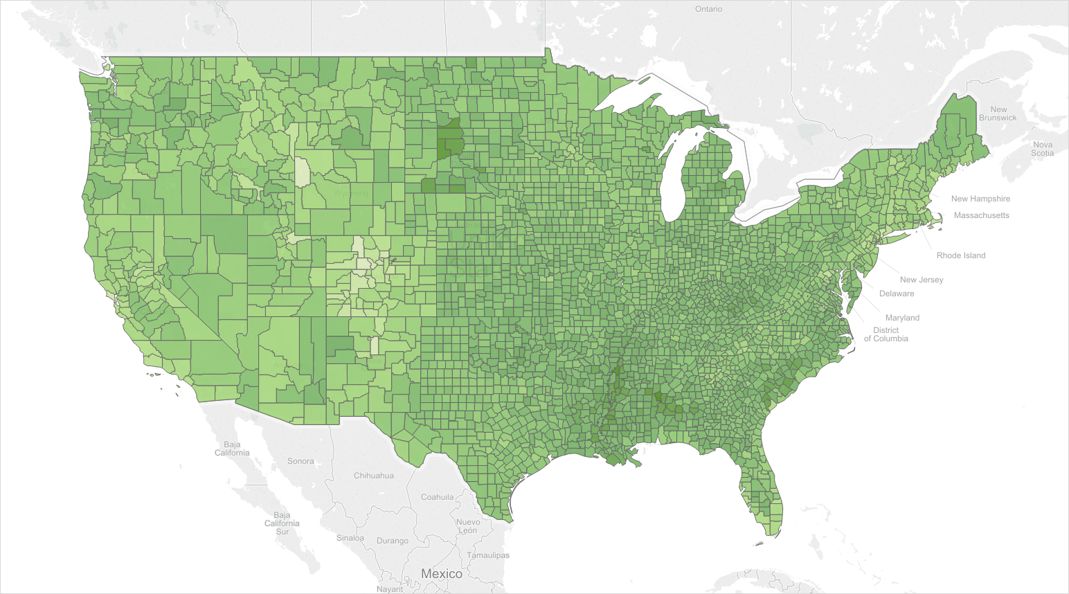
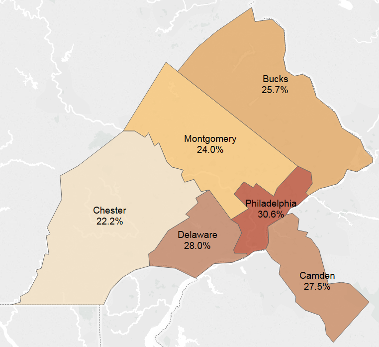
In-Class Exercise – Day 22-23 – Visualizing with Maps
In-Class Exercise – Day 22-23 – Visualizing with Maps.pdf
Canvas submission link for Oct 23 – https://templeu.instructure.com/courses/30770/assignments/44082
Canvas submission link for Oct 20 – https://templeu.instructure.com/courses/30770/assignments/43449
Unofficial Letter Grades
I have finished grading Assignment #3 and posted your Unofficial Letter grades on MIS Community Gradebook – https://community.mis.temple.edu/gradebook/
Your unofficial grade indicates what you would get if this was the end of the semester. Be advised that this is strictly unofficial and only to inform your current standing at this course. Your final grade will depend on your performance for the remainder of the semester.
Please let me know if you have any question.
Assignment #4 – Temple Analytics Challenge
In-Class Exercise – Day 21 – Visualizing KPIs
No class on Friday, October 13
Due to the instructor’s travel, there will be no class on Friday, October 13.
Extended Office Hours for Assignment #3 – Monday, Oct 16, 2 – 5 pm
If you need help for Assignment #3, please drop by Speakman 201A.
In-Class Exercise – Day 20 – Creating Inforgraphics
In-Class Exercise – Day 18 – Data Cleasing
Assignment #3 – Finding Bad Data in Excel (due by Oct 16)
Day 17 – Dirty Data – class slides and video
In-Class Exercise – Day 16 – Integrating Datasets
In-Class Exercise – Day 15 – Creating Interactive Dashboards
Misleading Graphs – Best Team
Anthony Mazza, Joe Arnold, Michael Granovskiy

This graph has a vertical axis that begins at 420 rather than zero. The lower bar is 445 and the larger bar is at 485. But The Times bar is shown as twice as big.

There isn’t a Y axis at all. 78% is depicted as twice as many books as 75%. The scale consistency is off and the number of books between percentages isn’t consistent.
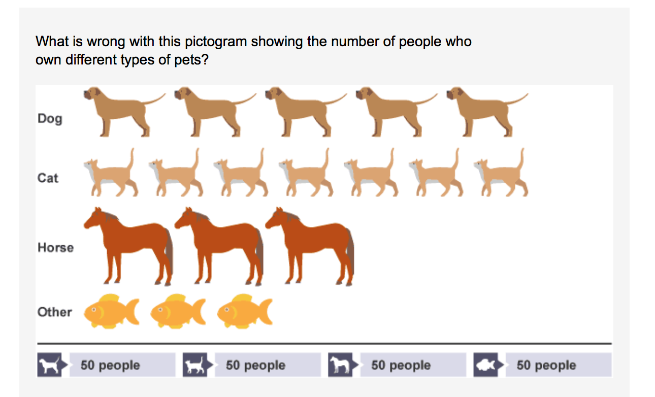
There is a misleading icon scale. Horses and fish have the same amount but horses are depicted as much larger. Most people own cats but it looks like just as many own dogs.

This graph is by far the most misleading. The raw numbers suggest that there are almost the same amount of working people as there are people on welfare. But when put in the graph, the bars represent 4 times the amount of people are on welfare rather than working a full time job.
Office Hours for Assignment #2 – Monday Oct 2, 2 – 5pm
Our IT Assistant, Cong Ngo, will have office hours on Monday, October 2 between 2 – 5pm at Speakman 201A.
In-Class Exercise – Day 14 – Finding Data Distortion
Day 14 – Data Distortion – class slides and video
Finding Cool Visualization – Best Group Note
by Ksenia Semina and Albert Semin
https://www.bloomberg.com/graphics/2017-us- defense-against- north-korean- nuclear-attack/
a. What are the sources of the data visualized?
The sources of visualized data are the rockets, military bases and their action during a fired missile
from North Korea.
b. What are the key messages in these graphics?
The key message behind is that USA is ready to defend it self and has the technology to prevent an
attack in minutes.
c. What kind of delivery means do the graphics adopt to deliver the messages?
The graph uses 22-minute time lapse that shows the movement of the missiles and their direction.
It also shows that the US has military bases in Japan and South Korean that immediately report
back to the US.
https://www.bloomberg.com/graphics/2017-cities- chronic-flooding/
a. What are the sources of the data visualized?
The level of water on land during certain time of the year. How much flooding a city experiences
and how much has it increased over the several years.
b. What are the key messages in these graphics?
Shows the damage in the city by the water and how far can it spread with time because of climate
change.
c. What kind of delivery means do the graphics adopt to deliver the messages?
They show how the water expands further into the city over time laps to future years.
Exam #1 scores posted on Gradebook
You can also find your in-class exercise scores up to Sep 20.
In-Class Exercise – Day 13 – Finding Cood Data Visualization
In-Class Exercise – Day 13 – Finding Cood Data Visualization.pdf
- Bloomberg (http://www.bloomberg.com/graphics)
- Pew Research Center (http://www.pewresearch.org/)
- The Economist (http://www.economist.com/blogs/graphicdetail)
- The New York Times (https://twitter.com/nytgraphics)
- The Wall Street Journals (https://www.pinterest.com/wsjgraphics/wsj-graphics/)
- The Washington Post (http://postgraphics.tumblr.com/)
- USA Today (http://www.usatoday.com/topic/E01C4890-85A2-4E0B-A3DD-58BD88E71251/interactive-graphics/)