Day 14 – Data Distortion
Misleading Graphs – Best Team
Anthony Mazza, Joe Arnold, Michael Granovskiy

This graph has a vertical axis that begins at 420 rather than zero. The lower bar is 445 and the larger bar is at 485. But The Times bar is shown as twice as big.

There isn’t a Y axis at all. 78% is depicted as twice as many books as 75%. The scale consistency is off and the number of books between percentages isn’t consistent.
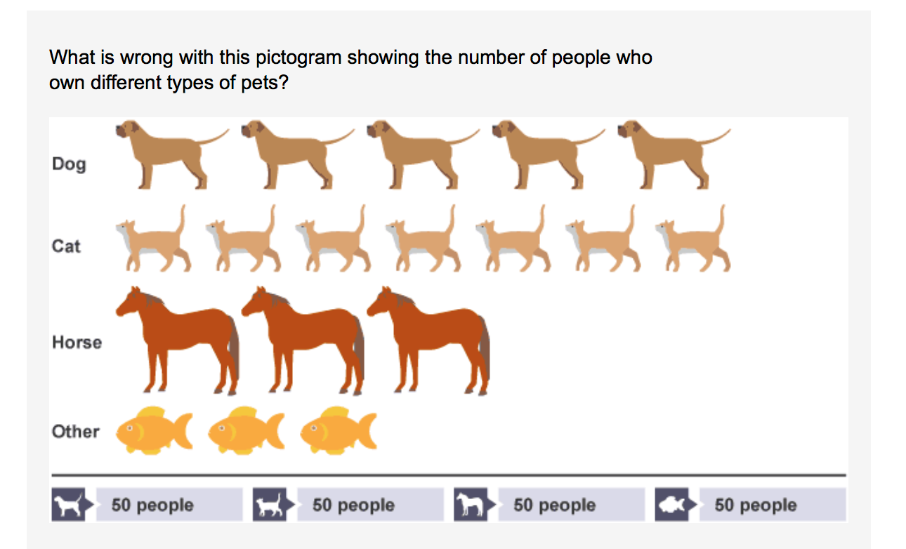
There is a misleading icon scale. Horses and fish have the same amount but horses are depicted as much larger. Most people own cats but it looks like just as many own dogs.

This graph is by far the most misleading. The raw numbers suggest that there are almost the same amount of working people as there are people on welfare. But when put in the graph, the bars represent 4 times the amount of people are on welfare rather than working a full time job.