Tableau Project
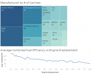
This Tableau dashboard is a sample of some of the data visualizations I created using Tableau in my Data Science class. These graphics use a data set that includes a large variety of data on car brands and the attributes of those cars. These two visualizations are a tree graph showing the manufactures and their number of carlines, and the correlation between cars average combined fuel economy and their engine displacement.