utilize python to make data visualization with real COVID-19 data
![]()
Utilizing Python to make data visualization
I was able to attend a webinar hosted by Girls in Chess and learn how to utilize python to make data visualization with real COVID-19 data. I learned that Pandas is one of the most widely used Python libraries in data science. The host emphasized the importance of Python and data science. Python is interactive, portable, modular, and dynamic, which makes it a great tool to use for data science. We went through a several step process of creating graphs with Covid-19 data using JupterLab. I was able to use concepts learned in class and from AIS workshops to get the output.
1. Get the data
2. Prepare the data – define features
3. First visualization – cases overtime
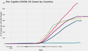
4. Second visualization- cases per 100,000 people
Output product :